Hindi Captions in Devanagari: Fonts, Matras and Line Breaks
Typography rules for Hindi captions so matras never clip, conjuncts stay intact and lines break where a reader expects.
Summary — the short answer
- Hindi captions that look wrong are almost always a typography problem, not a translation problem.
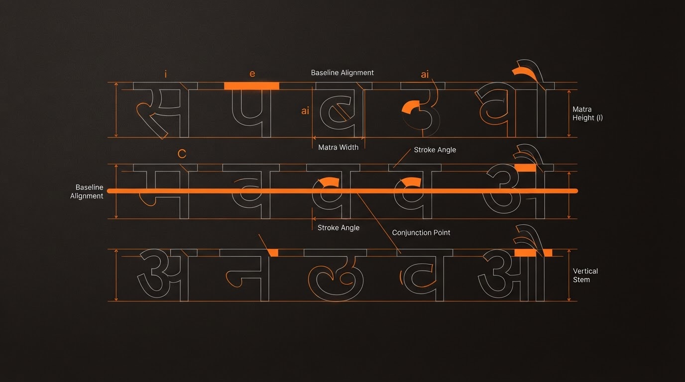
- Devanagari carries marks above and below the baseline, so it needs 15–20% more line height than Latin type.
- Never use synthetic bold — it thickens the shirorekha and destroys word shape.
- Break lines at word boundaries and never inside a conjunct cluster.
- Increase stroke or shadow slightly, because thin Devanagari strokes disappear against bright video.
Key facts
- Extra line height needed
- 15–20% over Latin
- Bold
- Real weight only, never synthetic
- Max words per line
- 4–5
- Alignment
- Left or centred short lines
- Stroke
- Slightly heavier than English
When Hindi captions look amateurish, the cause is rarely the words. It is the type. Devanagari has structural requirements that Latin-first caption tools ignore by default, and the resulting errors are visible to every Hindi reader even when they cannot name what is wrong.
Give matras vertical room
Devanagari places vowel marks above and below the baseline. Line height tuned for Latin type clips those marks, and the clipping is worst on exactly the characters that carry meaning. Add roughly 15 to 20 percent more line height than you would use for English captions at the same size.
This is also why stacking three caption lines rarely works in Hindi. Two lines maximum, with generous leading, reads far better than three tight ones.
Do not fake bold
Synthetic bold thickens every stroke uniformly. In Devanagari that destroys the shirorekha — the horizontal line running along the top of a word — by merging it with the letterforms beneath. The word stops reading as a unit.
Use a font family that ships a genuine Devanagari bold weight. Google Fonts has several well-engineered options with matched Latin companions, which also solves the bilingual pairing problem.
Break lines where a reader expects
- Never break inside a conjunct cluster; it produces a shape no reader recognises.
- Keep four to five words maximum per caption line.
- Prefer left alignment or short centred lines — long ragged centres are harder to scan in Devanagari than in Latin.
- Avoid hyphenation entirely.
Contrast and stroke over video
Devanagari strokes are generally thinner than the equivalent Latin at the same optical size, so they disappear faster against bright or busy footage. Increase stroke weight slightly compared to your English caption preset, and verify against the WCAG 4.5:1 contrast floor using your worst-case frame rather than an average one.
| Setting | English preset | Hindi adjustment |
|---|---|---|
| Line height | 1.1 | 1.3–1.35 |
| Weight | 800 synthetic ok | Real 700 cut |
| Stroke | 2px | 2.5–3px |
| Words per line | 3–4 | 3–4 |
| Font size | Baseline | Same or −5% |
Pairing Hindi and English faces
If your English captions use a geometric sans, pick a Devanagari face with similar stroke contrast and a matching x-height relationship. Mismatched pairs are the most common reason bilingual videos look like two different brands.
Frequently asked questions
Which fonts work well for Hindi captions?
Look for families with a real bold weight and a matched Latin companion. Noto Sans Devanagari and similar open families are safe, well-tested starting points.
Should Hindi captions be uppercase?
Devanagari has no case, so uppercase settings simply do nothing — or worse, trigger unwanted substitutions. Leave case transforms off for Hindi.
Why do my matras get cut off at the top?
Almost always insufficient line height or a container with hidden overflow. Increase leading first, then check the caption container padding.
Can I mix Devanagari and Latin in one caption line?
Yes, and it is common in Hinglish content. Just ensure both faces share a baseline and similar weight so the line does not visually step.
Sources and further reading
- Unicode Devanagari chartAuthoritative character reference including matras and conjuncts.
- Google Fonts KnowledgeTypography fundamentals including scripts beyond Latin.
- W3C — Indic layout requirementsDetailed specification of Devanagari layout behaviour.
- WCAG 2.1 contrast minimumThe 4.5:1 requirement your caption styling must meet.
- VerbCraft: why Hinglish breaks AI toolsThe transcription side of the same problem.
Use this article elsewhere
Copy a structured brief for ChatGPT, Claude, Perplexity or Gemini — it includes the key points and the canonical link so the assistant can cite VerbCraft properly.
https://verbcrafts.in/blog/hindi-captions-devanagari-typography